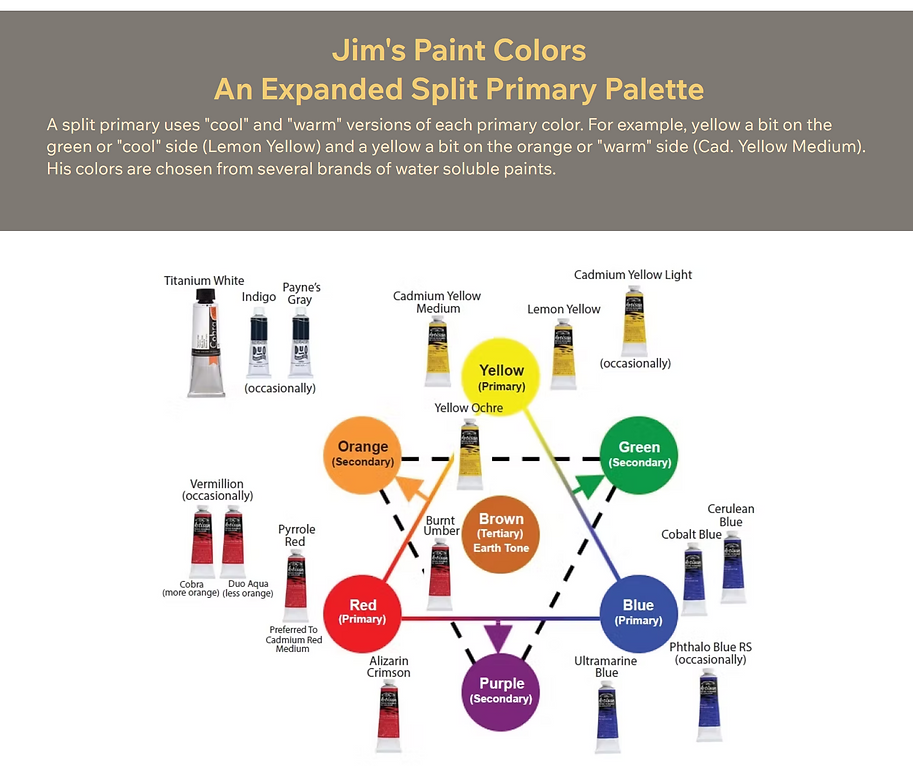


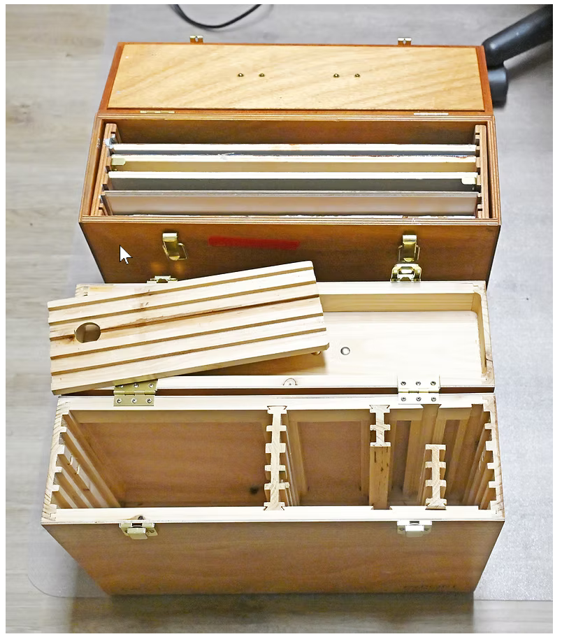
BRUSHES
& BOXES

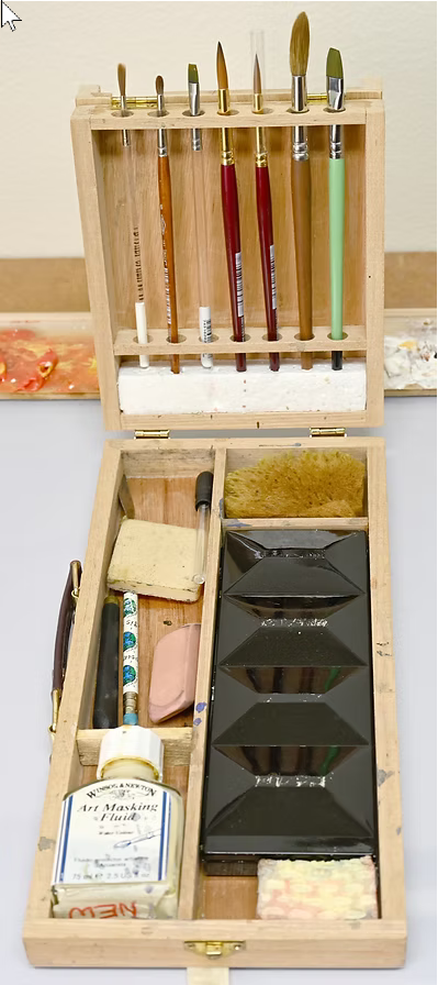
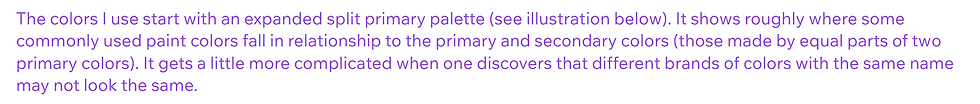
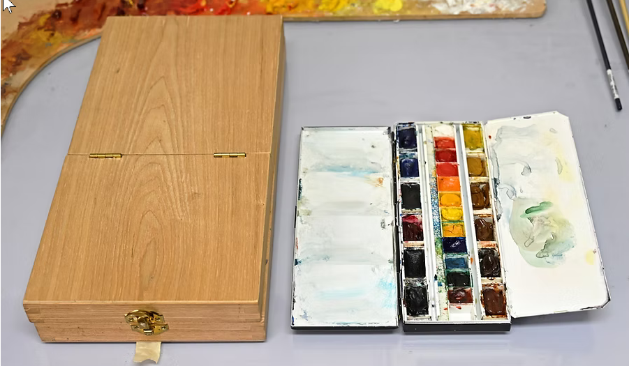
Left, a watercolor box with almost everything but watercolor paper.
Right, the box closed and its travel paint box open.
A Windsor & Newton foldable canvas brush holder. More different kinds of brushes show here.
Journey Way Points include observations, design criteria and/or other comments about some paintings. Sort of a problem resolution thing. These may be of interest to others in the early stages of their journey.
There is an INDEX page that shows which paintings have this information. Clicking on painting image will take you to it's WAY POINT.
To reach the Index page, Click on the Go To Index button on the bottom of this page.
THERE'S MORE
Art books, workshops and videos are the best way to pursue the next phases of your journey. I do have some tips on other areas under way. Should time allow, I hope to complete them. But for me, it's now back to all that got pushed aside.
BRUSHES
& BOXES


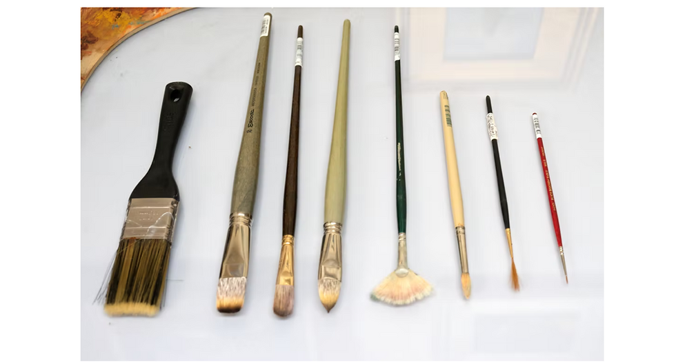
From left to right above: flat, bright, filbert, cat's tongue(?), fan, round, rigger and detail. There are also a number of specialized use types such as angled brushes. These all come in different sizes and with different types of hair; E.g. natural hairs; sable, squirrel, hog bristle, etc and synthetics; nylon, polyester, etc. The watercolor medium leans to soft-haired brushes (such as sable) while oil use favors bristle brushes. Of course, there are always exceptions, such as riggers for oil painting use soft hairs. Cheaper large bristle house-painting brushes work well for toning a canvas. There is much more to brushes than is covered here and looking into that provides another good learning opportunity.
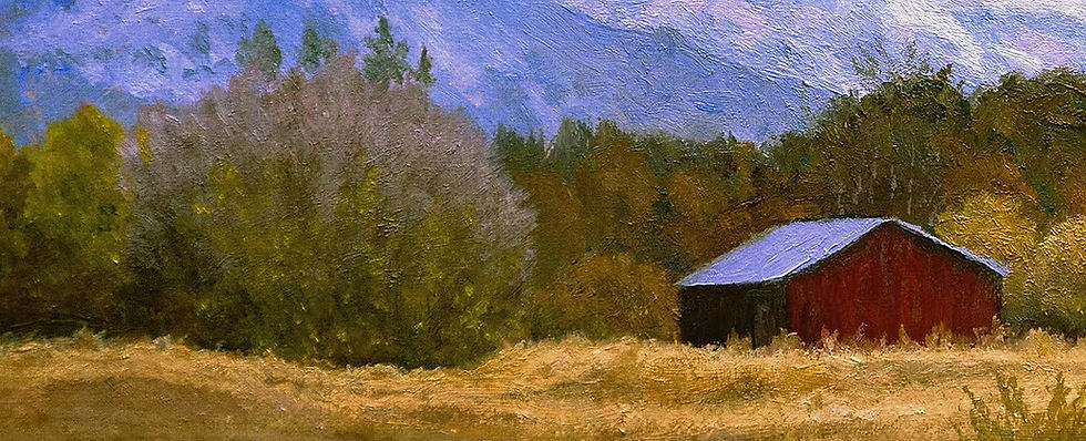
I am a fan of fan brushes. While not used often, they can provide very good results. The above is a 2" by 6" portion of a 9" by 12" painting. The multi-colored tree/bush on the left was finished off using one. By twisting it, vary-ing the angle of brush-to-canvas and varying the pressure of the brush against the canvas, the delicate placement of the greens and purples was easily accomplished. While possible using other brush types, the fan brush can do it more quickly and give more realistic results.


ON WAY POINTS
